
Infographics + Data Visualization
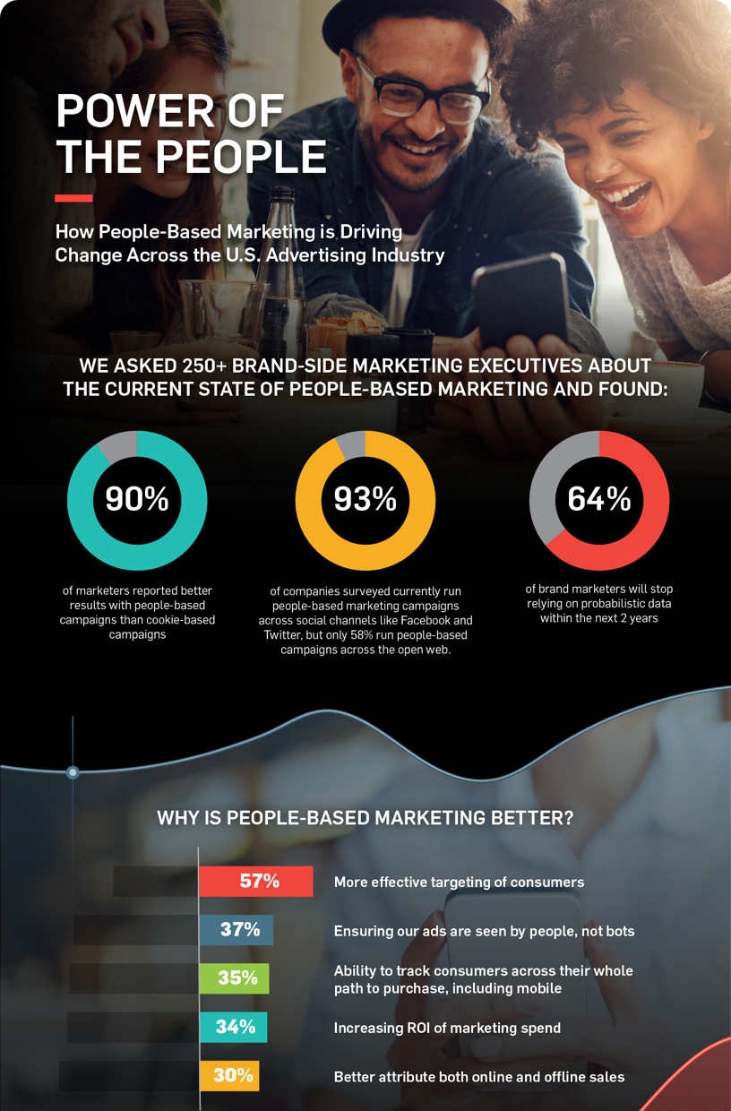


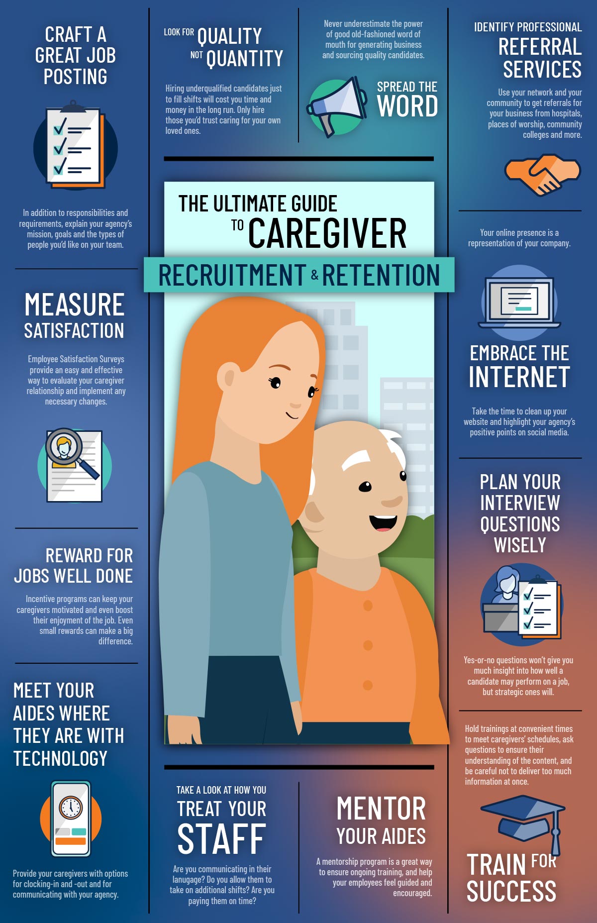
I always find Infographics and Data Visualization projects highly engaging. They consistently involve taking very, very complex insights and distilling them down into a format that, evidently, makes them easily digestible to the average viewer, while also wrapping a story around it to contextualize something that could otherwise be overly convoluted and potential somewhat dry.
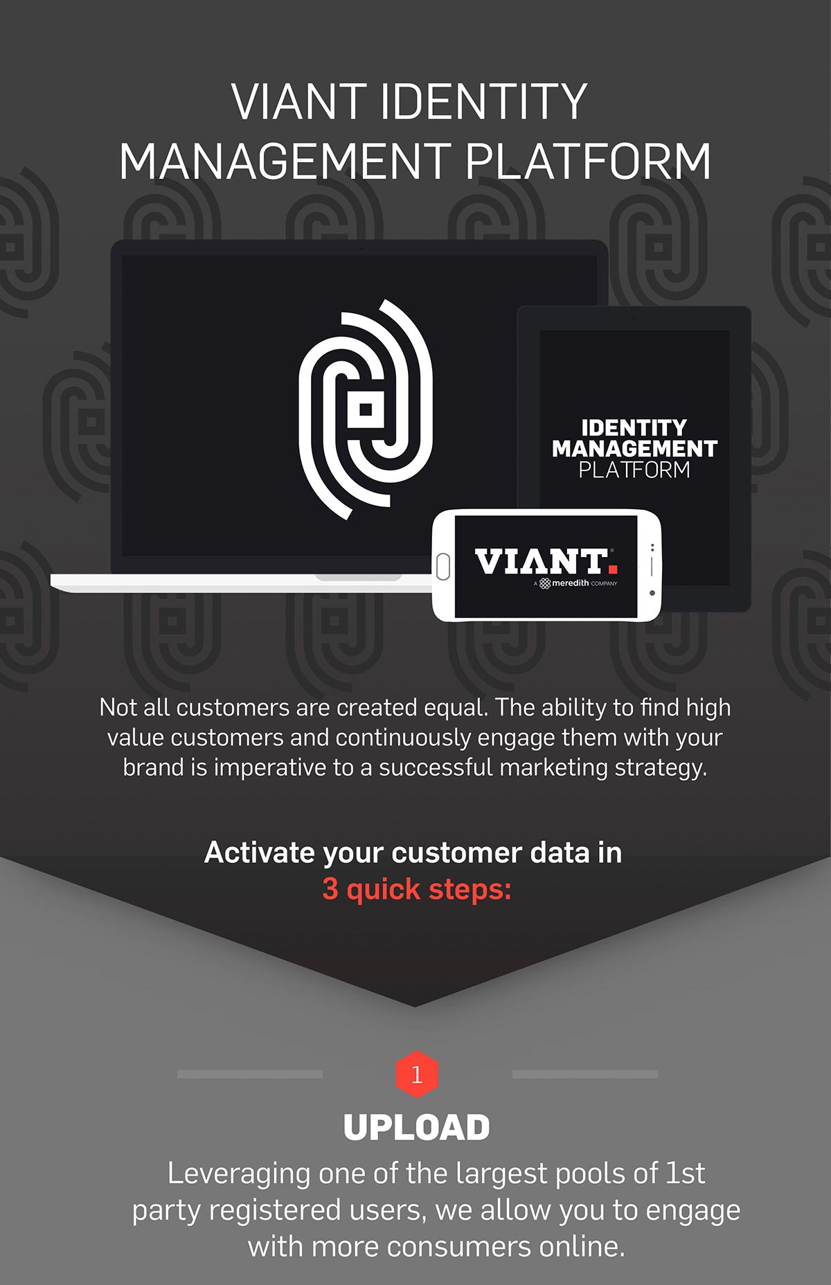
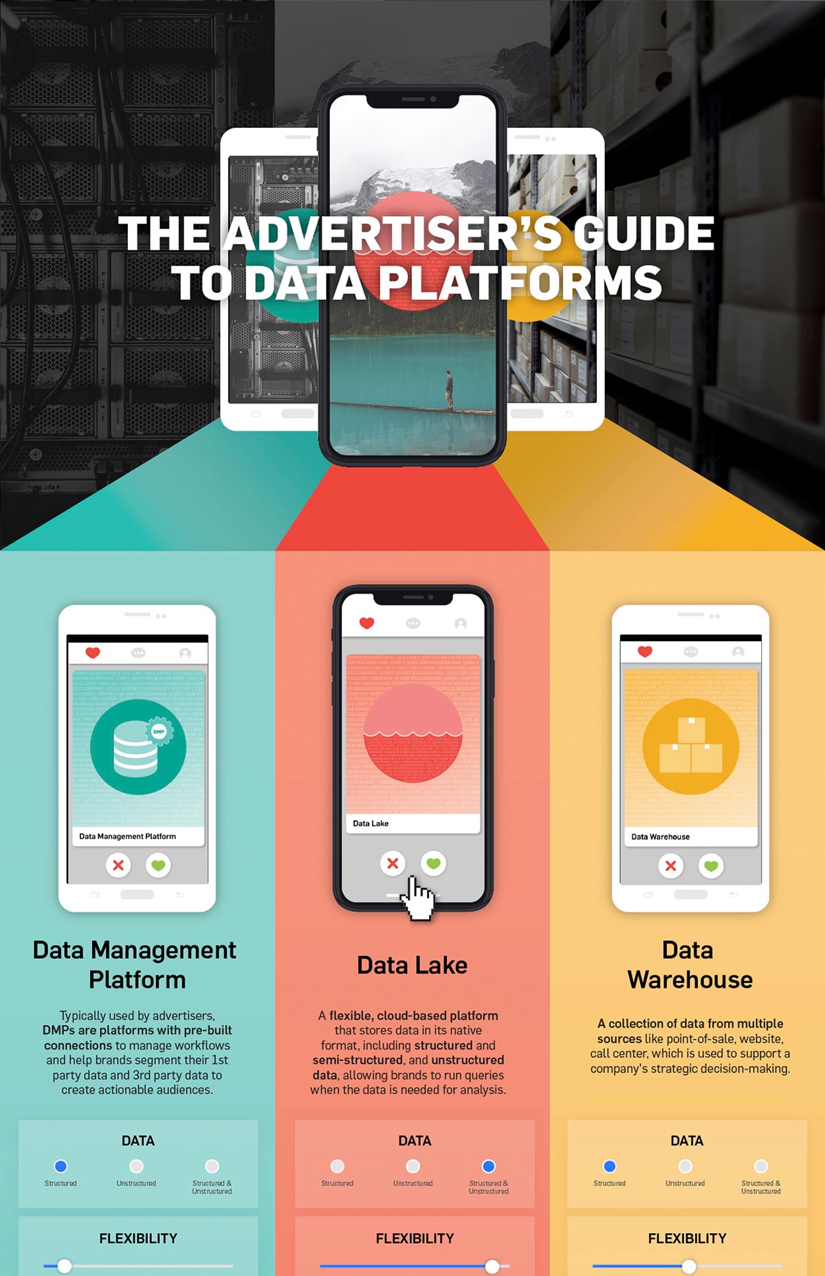
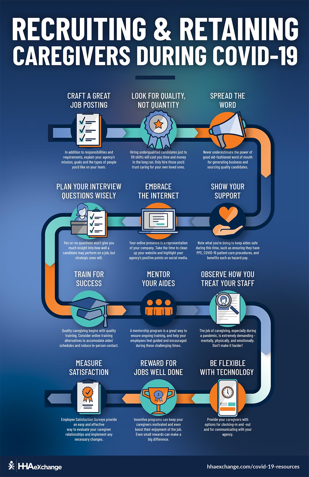
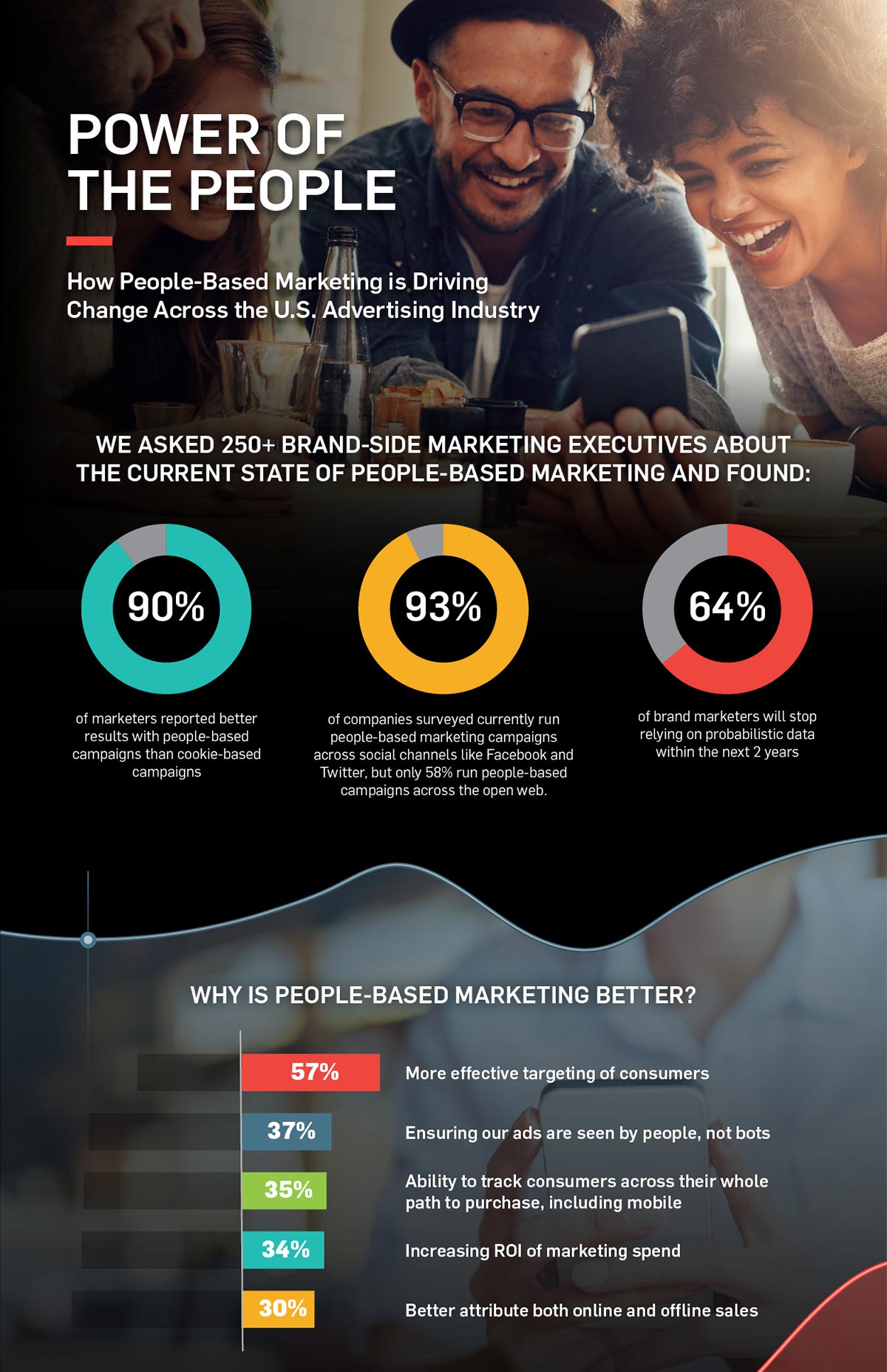
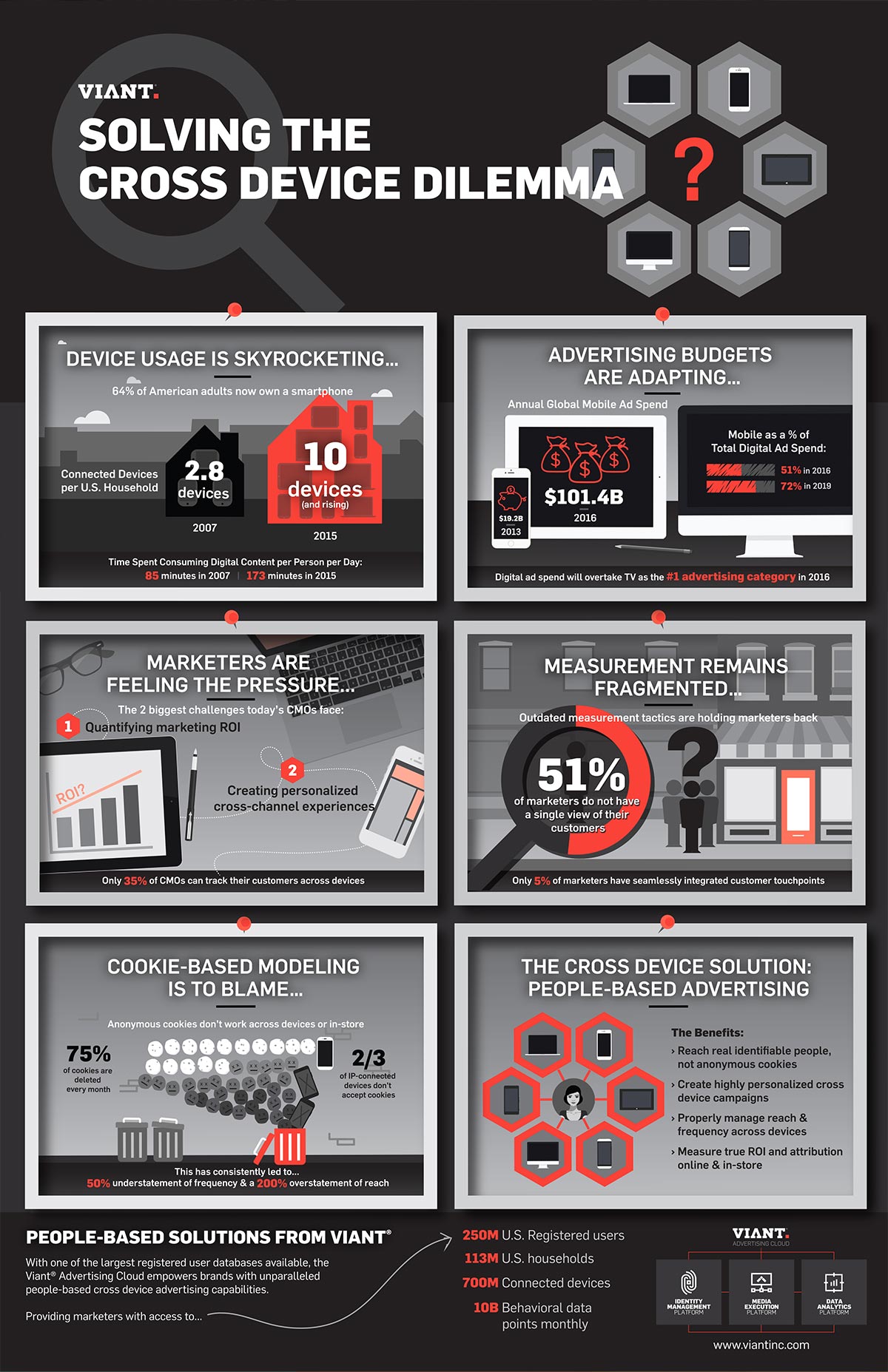
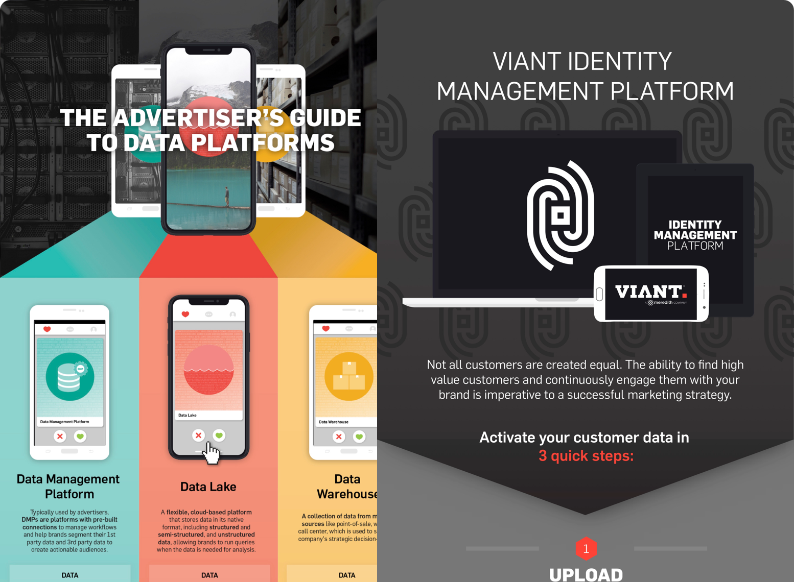
Of the three infographics at the bottom of the page, two of them involved walking the reader through complex AdTech workflows and one aimed to explain the finer details between three competing data platforms.
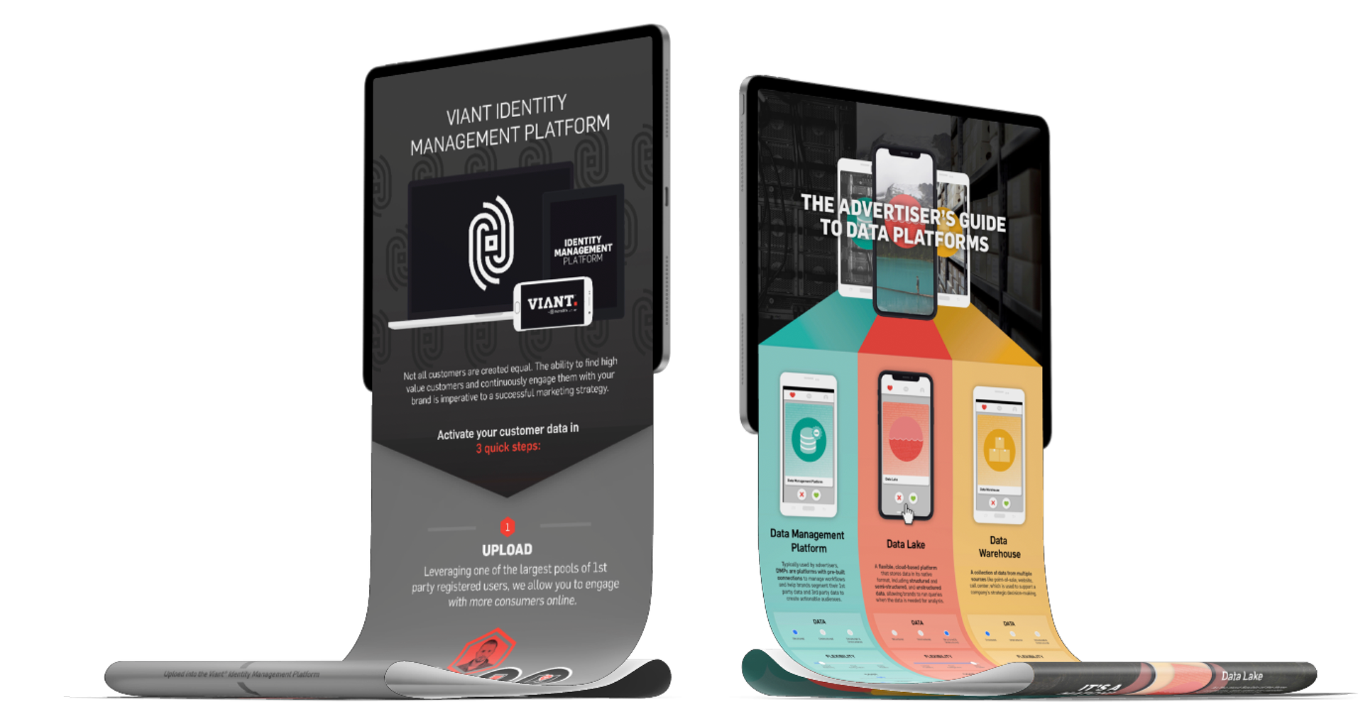
For each of these, I worked with data provided by a Data Science team and from there, I hashed out the manner in which the data should be presented (e.g. side-by-side comparison, step-by-step workflow, highlights and supporting findings, etc.).
Iterating draft by draft, I would bring the Infographic designs together by weaving the empirical data with a marketing-focused, relatable narrative and strong visually branded design elements.
The resulting Infographics that are featured on this page went on to be published in white papers, used as downloads to increase lead generation, and were used as both digital and printed marketing collateral for Sales and Leadership.